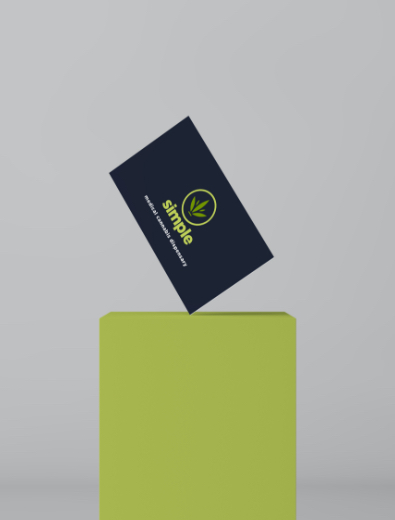
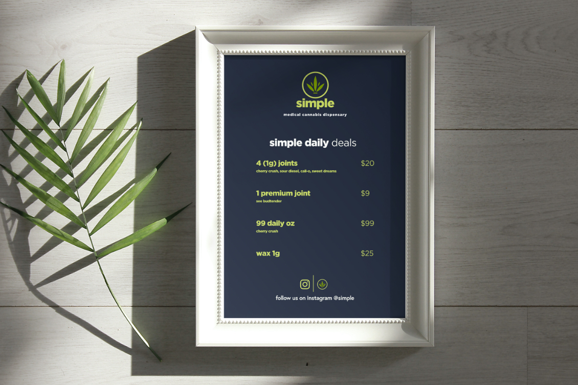
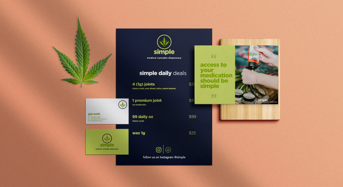
simple
medical cannabis dispensary
Cannabis Logo Design | Cannabis Website Design | Cannabiss Busines Card Design
Even in states where medical cannabis is legal, accessing products can still be a challenge for patients. People in pain or dealing with a serious illness don’t care about clever taglines or an intricately designed logo. They want the medication they’ve been prescribed. To align with Simple’s mission to make it easier to purchase medical cannabis, its branding is clear, direct, and — well, simple.

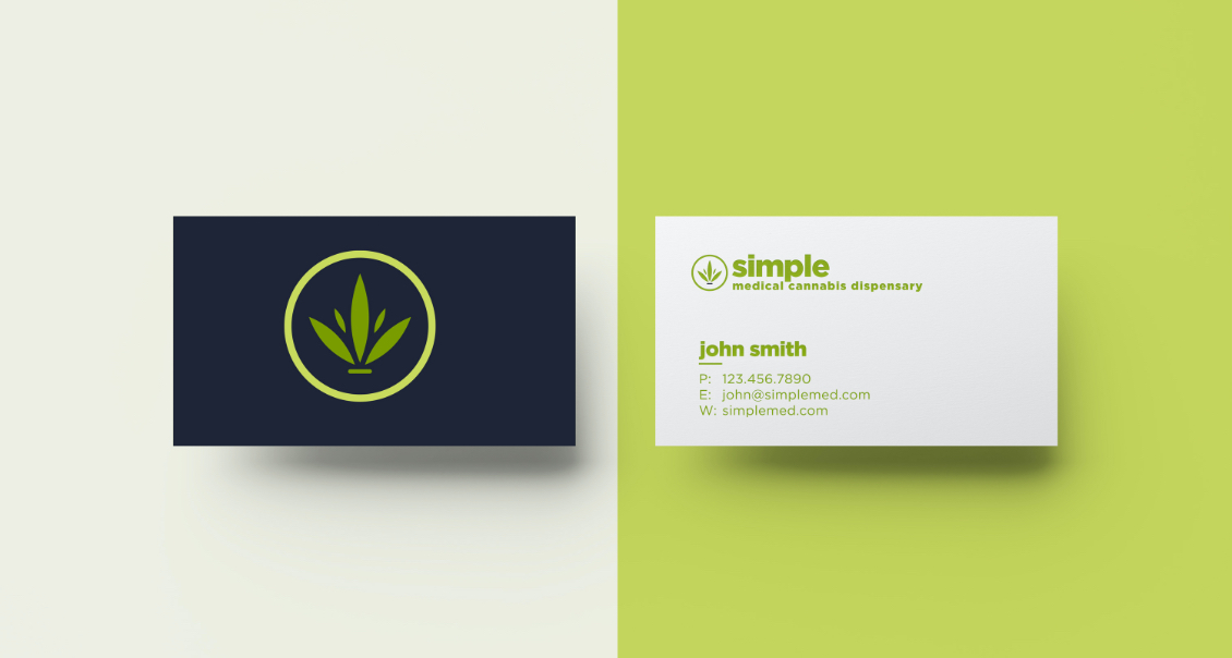
Simple’s logo is an elegant spin on a marijuana leaf and incorporates shades of green, the color most typically associated with cannabis. When you look at the Simple logo, there’s no guesswork needed to determine what kind of business you’re seeing.
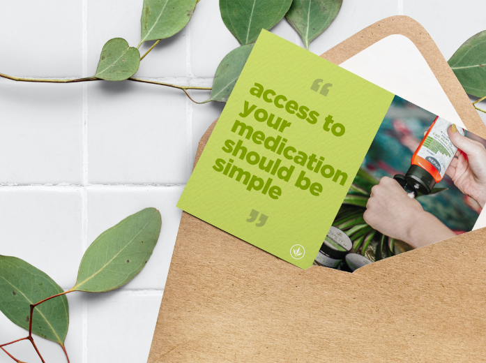
The Simple brand extends to non-consumable products. Packaging is kept minimalistic. There’s no unnecessary text, colors, designs or images — just the products meant to bring you relief and relaxation.
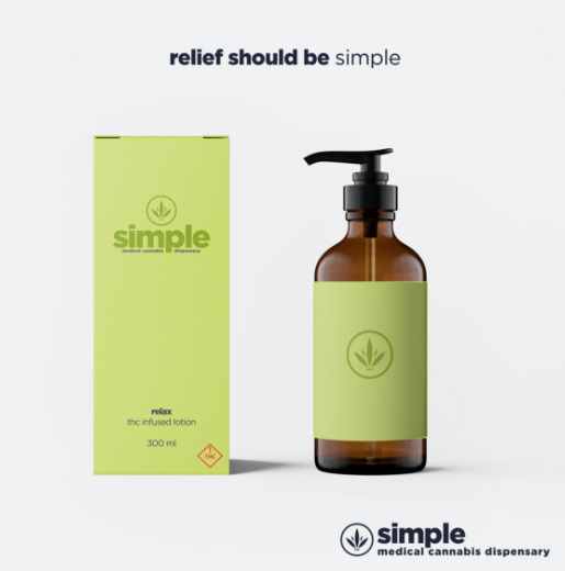
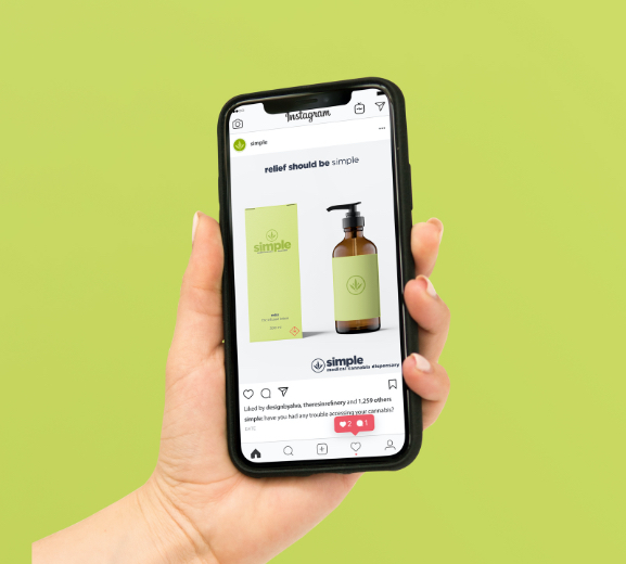
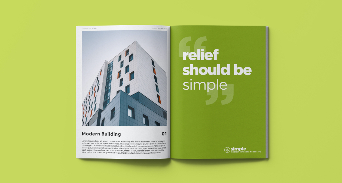
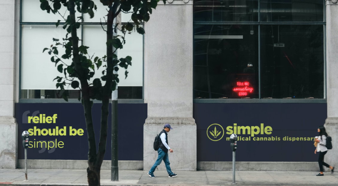
Simple’s marketing campaign focuses on the importance of patients having easy access to medical treatment.
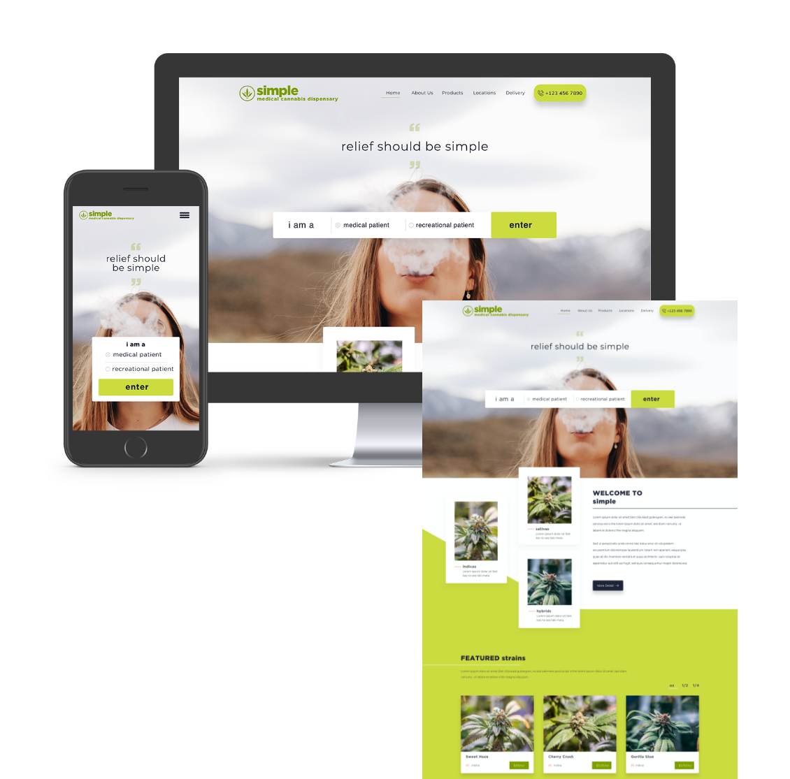
The Simple website is designed to provide a unique user experience based on the patient’s use of cannabis for medical or recreational purposes.